Posts Tagged 'theme colors'

PowerPoint Secrets: Color (Part 1)

banner.png

Color is a key design element in PowerPoint and there are a lot of ways to get color into your presentation. This post (and Part 2) will explore the sources of color in PowerPoint.

HISTORICAL NOTE: In the long, long ago, a thing called an “overhead projector” was used for presenting “foils” or transparencies. They were made on a “Xerox” that copied typed material to special transparent plastic sheets. Some radical pioneers used color pens to add color to bullets, etc., on the otherwise black and white projections.

I highly recommend that you consistently use a small set of colors (a color scheme) in your presentations – this will help assure a professional, unified impression on your audience. Please don’t make it up as you go along.

In PowerPoint, the tool for helping assure a consistent appearance, including the color scheme, is called a Theme. More about this later.

A couple of other tips:

  • You may not have a free choice of colors; if you are a corporate wienie (or working for one), there will probably be branding standards, including colors. Even for small organizations, you may want to be consistent with a logo or website.

NOTE: An earlier post describes a method for creating a color scheme based on corporate guidelines.

  • If you are not a graphics designer, and even if you are, look for inspiration; web sites, apps, television ads, etc. The PowerPoint Eyedropper tool can be used to “steal” colors from photos, screen shots, etc. (see Part 2).
  • Use only three or four “accent colors.” Any more will be confusing and make your presentation look less organized.
  • Occasionally, you will need a color or two that is not in your scheme. For example, you want a stop sign icon or a (US) fire truck and red is not in your color scheme.
  • “Color blindness (color vision deficiency, or CVD) affects approximately 1 in 12 men (8%) and 1 in 200 women in the world” (colourblindawareness.org). That means there’s a pretty good chance that some in your audience will have difficulty distinguishing certain colors. Guidelines for designing for CVD are available (here, for example).

NOTE: These guidelines make pretty good sense for the rest of us; I suggest you take a look.

Basics

Your first encounter with PowerPoint color is liable to be this Color Pane:

col1

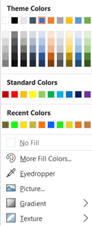
This pane appears when you select Fill or Outline color for shapes, lines, text, etc. on the Home ribbon, the Drawing Tools ribbon and several other places including the Format Shape pane.

Under Theme Colors, the first row indicates the 10 colors specified in the Theme for your presentation (this is the Color Scheme for this presentation). The Color Scheme determines the default colors for various objects and offers other color choices that, presumably, you have carefully selected to coordinate. In this post, I have used the Office Theme, the default option.

You should (almost) always use colors from this row.

NOTE: You can change your Color Scheme and other elements of  your Theme including default fonts and Slide Layouts (e.g., Title slide). You can select Themes from Microsoft and other sources or design your own. See my post on Themes or this excellent article to learn how to create a custom theme.

NOTE: I am surprised at the number of PowerPoint users I have encountered that don’t understand Themes, including graphic designers.  Many struggle to create a consistent appearance manually; some use the word “template” to describe a model slide and/or a color scheme.

The Theme Colors have particular roles that you should be aware of; these are hinted at by the labels attached to each color:

col11.png

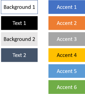
The Background 1 color determines the presentation slide background color (white for this “Office” Theme). The Text 1 color (black) determines the default text color. You should pick these two colors so that there is considerable contrast between background and text.

NOTE: In some contexts, these colors are called Light 1 and Dark 1.

Background 2 and Text 2 are apparently intended for similar purposes although I don’t think these colors are involved in any defaults or other features.

NOTE: You can change the default slide background color and use fill effects, images and other objects to build your slide backgrounds using the Format Background pane. See this post for more on slide backgrounds.

The six Accent colors complete your color scheme – use the first three or four of these for everything unless you have a good reason to use another color.

The Accent colors are also used by Tables, Smart Art and Charts to offer a several color options for these objects. See Part 2 of this post for more on this.

The next five rows (a total of 50 (!) colors) are variations of the 10 Color Scheme colors. These are based on the Theme colors but vary in lightness and darkness. Using shades of a single color can have problems so use this with care (if at all). See Part 2 for more on this.

The next row is called “Standard Colors” – I’m not sure why because they are in no sense “standard” in PowerPoint. Avoid these unless you need  red for a stop sign, etc.

The last “Recent Colors” row displays non-Theme colors that you have recently used, maybe as a result of an Eyedropper operation. If you are using a color from this row, maybe it should be in your Color Scheme! Again, avoid these colors unless you have a good reason to use one of them.

The next option on the list is More Colors. Why on earth do you need “more colors?”

If you are creating a presentation with an appropriate Theme, you shouldn’t need “more colors.” On the other hand, if you are creating a Theme, this is where you actually specify the Theme colors. You should use this tool only to build your Color Scheme. Do not dip into this pot just because you feel  like it.

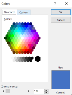
Selecting More Colors reveals, not surprisingly, the Colors pane. The Colors pane has two tabs: Standard and Custom. Here’s the Standard tab:

col2.png

In the Standard tab you can select from an array of 127 pre-set colors or one of 15 grayscale options. Again, there is nothing standard about these colors; this is just a way to select “common” colors.

Notice that there is a Transparency option – you should use transparency when you actually want a transparent object, not to create a color variation. The reason for this is fairly obvious: you probably don’t want the color to change when you move, copy or share the object, depending on what’s behind it.

The rectangle at the lower right allows you to compare the Current color of the selected object with the New color that you have selected from the array.

The other tab is Custom; it provides a another way to select colors:

col3.png

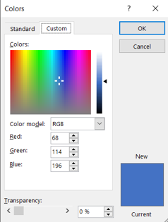
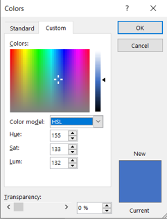
You can select colors using this pane by moving the “cross” around the “rainbow” box and by moving the slider on the right. Note that there is a “color model” option; the default is “RGB;” it’s much easier to understand what’s going on in the color pane if you select the alternative “HSL” model:

col4.png

A color model is a mathematical way to represent or encode colors using numbers (essential in the computer world); this turns out to be complicated because of the nature of human vision.  PowerPoint offers two options: the RGB (red-green-blue) model and the HSL (hue-saturation-luminosity) model. Each of these uses three values to uniquely identify the color. There are other models and variations in use; you may have encountered HTML or CMYK (used in print work) for example. Web sites are available that convert encoding between models.

With the HSL model, it is easy to see how the color selection works:

  • Moving the cross horizontally changes the color (Hue); note how the corresponding numeric value changes (0-256).
  • Moving the cross vertically changes the “grayness” or Saturation of the color from solid gray to a “pure” version of the color.
  • Moving the slider changes the “lightness” of the color from black to white at the extremes.
  • You can also enter the HSL/RGB numeric values directly. This is necessary when you are creating a color scheme using a corporation’s color scheme or other source since the Eyedropper option is not available.

NOTE: The HSL model seems much more intuitive to me than RGB – I have no clear idea what will result from changing the Red value of a color, for example.

The HSL model also provides some insight as to how the 50 variations of the Theme Colors (see above) are produced. For example, the first row is labeled Lighter 80%. In HSL terms this means that the luminance of the variation is 80% “lighter” than the corresponding theme color. Since “lighter” means higher values of the luminance number, the luminance of the variation is 180% of the luminance of the theme color. For the Accent 1 (blue), the luminance is 132; the luminance of the first variation is calculated as 1.8*132=238. The hue and saturation values are unchanged. Here are the calculations for five variations of the Accent 1 color:

col6.png

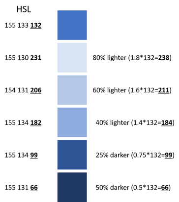
NOTE: Some of the calculated values of the luminosity differ slightly from the PowerPoint value. Also, the Hue and Saturation values vary slightly among the variations. This may be because a the colors were specified using the  RGB model.

Defaults

The Color Scheme determines the default colors for Shapes, Lines and Text. Here’s the default Rectangle determined by the “Office” Theme:

col7.png

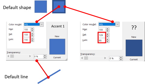
The default Rectangle has a blue Fill and a narrow Outline of darker blue – I copied the Rectangle and increased the width of its Outline for clarity. The default Fill is the Theme color called Accent 1. The Outline, however, is not a Theme color, not even one of the 50 variations (turd)!

NOTE: This inconsistency is a signal of more shenanigans in PowerPoint color yet to be revealed.

NOTE: Regular readers of this blog will know that I use the icon (turd) to highlight PowerPoint stupidities in a refined and inoffensive way.

The default Line color is Accent 1 – again, I have increased the default width  for clarity.

The color scheme also determines the colors of default Text:

col8.png

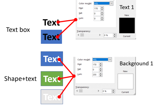
The first example is the default Text Box (created by using the Text Box Shape from the Shapes menu, for example). The default is no Text Outline and the Text fill color is Text 1 from the color scheme. There is no Text Outline and the Shape containing the text has no Fill or Outline.

NOTE: If you want to change the default Shape, Line or Text, create the version you want, right click, and select Set as Default … .

If I add a dark Fill to the shape (the second example), there is poor contrast between the text and the fill but no (automatic) change of color occurs.

On the other hand, if I type text into a shape with a dark Fill (the third example), the Text Fill is automatically set to Background 1 (white), presumably to improve the contrast. But, if I change the shape Fill to lighter colors, the Text Fill is not changed (second and third examples). As you can see, the light gray example is unacceptable.

What we have here, gentle reader, appears to be only a half-assed attempt to automatically avoid poor contrast (turd).

Ironically, PowerPoint’s own “Accessibility Checker” flags the blue, green and light gray text boxes as having “hard-to-read text contrast.” PowerPoint does not like its own choices (turd).

The next post in this series will explore other PowerPoint tools for creating color.

If you have questions, praise or complaints, please add a comment below. If you appreciate my efforts, liking or following this blog might be a good idea.

Warning! Defective “Template!”

scaffolding-incomplete_1274873258

Often, when  a client  gives me their corporate PowerPoint “template,” what I get is a default PowerPoint presentation file with, at most, a slide background and a title slide background.  The client has asked the company’s design firm (or department) for a “template” and this is what they got.

So, I spend the first hour or so of the project completing the “template” so I can get on with the assignment.  This is OK with me since these are paid hours, but I can’t help thinking that there are a lot of companies out there that are being treated in this shabby way by their design teams.

So, why does it matter? The purpose of the “template” is to assure that the look and feel (part of your corporate branding) works in your presentations as well as your web presence and printed collateral.  A defective “template’ will allow  the presentation color scheme, fonts and graphics to be all over the place.

The reason you have a defective “template”  is that graphic designers are generally PowerPoint-illiterate.  Certainly, PowerPoint is a poor stepchild as  a design tool and beneath the  contempt of a truly creative graphics designer. Besides, if designers produced their work in PowerPoint, their customers might make small changes on their own, without paying the design firm to do so.  Bad business.

I also believe that designers (and many others) misunderstand the role of PowerPoint in the presentation scenario – for example, that there is usually a presenter, who is primarily responsible for delivering the message.  Designers and marketing types generally seem to think in terms of a printed document where the message is carried by the document.

Let me digress to make sure that we are on the same page regarding templates.

You should understand  that a PowerPoint file containing desired colors, fonts and some slide examples with titles, your logo, etc., is NOT a template. A template is a special file (a .thmx or .potx file) that you use to set the default colors, fonts and slide formats/layouts.

For example, the color choices that appear when you set a Fill or Line color are determined by the current template/theme. The Headings and Body fonts that appear at the top of the font list are also determined by the template. The body font is the default font that is used when you create text. The master slide and the layouts that determine the overall appearance of your slides are also defined by the template.

Microsoft now uses the word theme for this special file. For purposes of this post, I will use the terms template and theme interchangeably.

If you look at the Design ribbon, you will see an array of slide images that represent themes. The first image represents the theme that your presentation is now using. If you use the pull-down menu associated  with Variants, you can see some of the details of the fonts and colors you are now using (highlighted). If you View the Slide Master you can see the slide layouts available to you with the current theme.

You can use the tools on the Design ribbon to modify themes and create new ones.

So, here is what you should get when you ask your designer for a complete “template”  :

  • Color scheme – when you select a color for a fill or outline, you choose from colors in the color selection pane.  If these have not been specifically assigned, a default palette shows up and these colors (or random ones) will be selected and your presentations will loose your corporate identity.
    I have thoughtfully provided some guidelines for color schemes here.
  • Fonts – you probably have corporate fonts;  specifying these as  your Theme Fonts will make them the default for PowerPoint text rather than Arial or Calibri.
    I have recorded my guidelines for fonts  here.
  • Master slide and layouts – slide backgrounds;  slide title and bullet formats; layouts for the title slide, section title slides, etc., are all determined by the Master Slide and a number of Layouts.
    Slide backgrounds are an area where graphic designers like to exercise their skill, usually at the expense of the actual slide content.  Here’s my rant on bad slide backgrounds.
    I have also provided some details on working with masters and layouts in this amusing post.

So, to assure that your presentations are not crippled by an incomplete “template,” make sure your designer provides the elements noted above.  Or, hire a PowerPoint specialist, like me.

A Question of (PowerPoint) Color – Updated

(This is an extended version of an earlier post.)

Your presentation will appear more unified and professional if you define and consistently use a small number of colors.  PowerPoint helps you do this with “theme colors” (“color scheme” in PowerPoint 2003).

When you select a color for an object Fill, for example, “theme colors” are shown in the top row of the color selection panel.  The idea is that you will consistently select from these colors as you build your presentation.

color selection pane

An array of variations of the theme colors are presented below the theme color row – more about this later.

Microsoft and others provide tons of advice on color and a bewildering array of predefined theme color sets; I’m sure you can find hundreds of other choices on the web.

But how do you decide what colors to use?

Your guess is as good as mine on how to choose one of these predefined schemes.

Fortunately, it’s pretty easy to define your own theme colors or modify the colors of a canned scheme; of course, you still have to decide on the actual colors in the theme.

I don’t have a universal formula for defining theme colors but I have developed a recipe that works pretty well for the work that I do.  It may help you, too, or at least provide a starting point.

My Perspective

I am skeptical about theories that assert an inherent link between emotions and colors, and some authorities agree, saying that individual reactions to colors are largely determined by cultural background, experience and context (for another view, see colorvoodoo.com).

Often, color likes and dislikes are intensely personal, usually because of a past experience.  Your boss or your client may be a victim of this and actually outlaw some colors.

Some color combinations evoke an immediate association in US culture: red and green for Christmas, orange and black for Halloween, primary colors for children, pastels for babies, etc.; I’m sure there are similar associations in other cultures.  I don’t think it’s advisable to try to use these combinations in other contexts.

I also  find it hard to create a consistent look using 6 or 8 different colors (hues) – so I am inclined to work with a smaller number (3 or 4) of hues along with variations on those hues.

If, like me, you create business presentations for your organization or other enterprises, the color problem is usually more easily solved since the company will likely have a “look and feel”/branding scheme.  This will include color guidelines based on two or three colors.  Even small companies without explicit guidelines will have a logo, website, and printed collateral that reflects a color scheme.

Your client or company may even have a standard PowerPoint “template” provided by the company’s creative agency.  Usually, it won’t actually include a custom theme since “graphic designers” are often not PowerPoint literate.

My experience with existing “standard” corporate templates and templates purchased from third parties has not been good.  I discuss issues with templates in another post.

So, for your company or your corporate client, you need a palette that is consistent with the corporate scheme and is flexible enough for variety and emphasis where needed.  I suggest you try my recipe and then create your own variations as you gain experience with it (just like cooking).

Theme Color Basics

The Colors button on the Design ribbon will list available color schemes – built-in schemes and any “custom” theme colors that you have defined.  At the bottom of the list is the Create New Theme Colors… option.  Selecting this option will display this pane:

create theme colors pane

This pane displays the current theme colors and provides tools for changing each color.  Once you have Saved a theme, it will show up in the Design/Colors list.

There are 10 theme colors available in PowerPoint 2007 and 2010:

Text/Background Dark 1 and 2
Text/Background Light 1 and 2
Accent 1 through 6

Two additional colors (hypertext and followed hypertext) are available for definition but these are not available in the top row of the theme colors pane and consequently are not easy to use.

PowerPoint 2003 provides 8 colors in a “color scheme,” similar to the theme colors.  The recipe given here can be applied (with obvious changes) with PowerPoint 2003.

The variations presented in the color selection pane (below the theme colors) are created from the theme colors by varying the luminance (lightness and darkness) by certain percentages, relative to the luminance of the associated theme color.

color selection pane with variations

Note that there are 48 colors available here – 8 theme colors and 40 variations. Also, the complete color selection pane also offers 10 “Standard Colors” and a number of “Recent Colors:”

So, there are 60+ colors in this pane – I think this is too many choices.  Once you, or your client, start to use too many variations,   it becomes difficult to match colors that have already been used.  Consistency begins to deteriorate.  Also, since the theme color variations are created by adjusting luminence, they may not be visually consistent with the basic theme colors.  For example, the first three blue variations under the first (dark) blue in the array above seem too “bright”(over-saturated)  to my eye.

And, for obvious reasons, the “standard” and “recent” colors should be avoided.

When you create new theme colors, you will probably use the More Colors… option.  You can choose the Standard (fixed color wheel) tab or the Custom (color model) tab for more control:

I have selected the HSL (hue, saturation, luminance) model – for creating and adjusting colors, the HSL model seems more intuitive than the RGB model.  That is, I have no idea how to modify a color by changing the red-green-blue mix.  On the other hand, changing the hue (base color), saturation (grayness) and luminance (lightness) gives fairly predictable results.

In this tab, the color last selected is represented by the three numbers (Hue, Sat and Lum); you can modify the color by adjusting these values.  Within the color space, moving the cross-hair symbol horizontally changes the hue; moving vertically changes the saturation.  Notice that all colors with zero saturation are gray (like cats in the dark).  The slider on the right changes the luminance (lightness or darkness).   You can change the value windows directly for more control.  Experiment to get a feel for these controls.

Of course, creating a palette is an iterative, experimental process.  You should work experimentally with a palette over a few variations before declaring it “official.”  Naming your theme color sets will help you keep them organized.

If  you let your experimental/trial palettes “escape” to other users before you finalize,  you will have some maintenance issues – I need another post for that.

Theme colors are used automatically by PowerPoint for various objects, ranging from simple shapes to SmartArt and WordArt objects and charts.  For the more complicated objects, a range of “styles” are offered, using the theme colors in different variations. In all cases, you can choose your colors or change the colors that have been automatically selected by PowerPoint.

The Recipe

Companies typically have one or two corporate colors that they use with white or black.  My basic recipe assumes two corporate colors:

  1. Choose pure black for Text/Background Dark 2 and pure white for Text/Background Light 2.  I have found that I always need these colors, so put them in the palette for convenience.
  2. Choose a dark gray for T/B Dark 1 (e.g., HSL = (51,51,51).)  Choose a very light gray (248,248,248) for T/B Light 1.  These are useful for shadows, gradients and some other situations.

These are the default colors for dark text on light backgrounds and light text on dark backgrounds.  Using these grays rather than the pure black and white for text is a little more elegant to my eye.  You may not agree.

  1. Set Accent 1 and 2 to the corporate colors.
  2. Set Accent 3 and 4 to variations of the two corporate colors.  Usually I use a lighter variation –  increase the luminance to “lighten,” adjusting the saturation if the color is too “bright.”  Occasionally, if the corporate colors are light, you will want darker (lower luminance) variations.  Make sure these colors are clearly different than the base colors.  You can use these colors and remain consistent with the overall scheme.
  3. Set Accent 5 and 6 to colors that contrast (usually “complementary” – opposite on the color wheel) with the corporate colors. These colors will be used sparingly as accents.  If possible choose both a dark and light accent.
  4. Alternatively, pick just one accent and create three variations on the dominant corporate color.

As you work with this recipe, other variations will occur to you (see the examples below). That’s fine but I recommend that you don’t introduce an entirely new color that is not a variation on the corporate colors or a contrasting accent.

In some cases, you may not have an RGB/HSL specification for the corporate colors.  In this case you can “sample” colors from the company’s website or marketing materials using the Eyedropper tool – create a rectangle and on the Fill menu, use the Eyedropper tool to click on the color in an image (previously inserted). You can now select the rectangle and select the More Colors pane to determine the RGB value. Obviously, this may not be 100% accurate.

You may have a PANTONE™ color specification (used for printing); there are websites that convert PANTONE numbers to RGB.  I’m not sure how reliable these are.  You might also have a CMYK spec; again, converters are available on the web.

Examples

Here’s an example for a fictional client (see the “Acme” logo) with blue and green corporate colors.  The two corporate colors are included in the palette along with a lighter (higher luminance) version of each.  Red and orange are complementary high contrast accent colors.  Of course, the accent colors will be used sparingly.

Here’s a sample slide showing the colors and demonstrating how they might be used in text and graphic objects:

theme colors example 1

The background in these examples is a light gray gradient.  The subject of backgrounds will be treated in another post.

Here’s a more subtle variation that replaces one accent color with a lighter shade of the corporate blue, and selects a bright green for the remaining accent:

theme colors example 2

Here’s a very restrained version that uses only variations of the corporate colors:

theme colors example 3

Here’s a variation for single corporate color (blue) – I added grays and a third variant of the corporate color, along with a contrasting accent.

theme colors example 3

Use these ideas as a starting point and don’t be afraid to modify the theme colors as you work through the early stages of presentation design.  Don’t select theme colors and get them approved without trying them out.

Caveat

Try your scheme with the end display device. What looks good on your desktop or laptop may look a lot different on other devices, particularly portable projectors.  If your target device is a computer or TV display, you’re probably in good shape.  Projectors, on the other hand, may have problems accurately producing particular ranges of colors, particularly near the red end of the spectrum.

A Question of Color

Your presentation will appear more unified and professional if you consistently use “theme colors” (“color scheme” in PowerPoint 2003).

“Theme colors” are shown in the top row of the color selection panel; the idea is that you will select these colors for consistency as you build your presentation.

color selection pane

An array of variations of the theme colors are presented below the theme color row – more about this later.

Microsoft and others provide tons of advice on color and a bewildering array of predefined theme color sets; I’m sure you can find hundreds of other choices on the web.

But how do you decide what colors to use?

Your guess is as good as mine on how to choose one of these predefined schemes.

Fortunately, it’s pretty easy to define your own theme colors; of course, you still have to pick colors.

In the face of these difficulties, I have developed a formula that works pretty well for the work that I do.  It may help you, too, or at least provide a starting point.

My Biases

I am pessimistic about theories that assert an inherent link between emotions and colors, and some authorities agree, saying that individual reactions to colors are largely determined by cultural background and context (for another view, see colorvoodoo.com).

Often, color likes and dislikes are intensely personal, usually because of a past experience.  Your boss or your client may be a victim of this.

I find it hard to create a consistent look using 6 or 8 different colors (hues) – so I am inclined to work with a small number of hues and variations on those hues.

I do serious business presentations for others.  Fortunately, this usually makes the color problem easier since the company will likely have a complete “look and feel”/branding scheme which includes color guidelines based on one or a few colors.  Even small companies without explicit guidelines often have a logo, website, and printed collateral that reflects a color scheme.

Your client or company may even have a standard PowerPoint “template” although it may not include a consistent color palette.  My experience with existing “standard” corporate templates has not been good.  I’ll discuss issues with templates in another post.

So, for your company or a corporate client, you need a palette that is consistent with the corporate scheme and is flexible enough for variety and emphasis where needed.  I suggest you try my recipe and then create your own variations as you gain experience with it (just like cooking).

Theme Color Basics

The Colors button on the Design tab includes the Create New Theme Colors… option at the bottom of pane; this pane will appear:

create theme colors pane

There are 10 colors available:

Text/Background Dark 1 and 2
Text/Background Light 1 and 2
Accent 1 through 6

Two additional colors (hypertext and followed hypertext) are available for definition but these are not available in the top row of the theme colors pane.

PowerPoint 2003 provides 8 colors in a “color scheme,” similar to the theme colors.  The recipe given here can be applied (with obvious changes) with PowerPoint 2003.

The variations presented in the color selection pane (below the theme colors) are created from the theme colors by varying the luminance by certain percentages, relative to the luminance of the associated theme color.  These are occasionally useful when you need a color with a slight contrast to one of the theme colors (for example, a shadow or gradient).

color selection pane with variations

For creating and adjusting colors, the HSL (hue, saturation, luminance) color model is more intuitive than the RGB model.  That is, I have no idea how to modify a color by changing the red-green-blue mix.  On the other hand, changing the hue (base color), saturation (grayness) and luminance (lightness) gives fairly predictable results.  Of course, creating a pallete is an iterative, experimental process.

Theme colors are used automatically by PowerPoint for various objects, ranging from simple shapes to SmartArt and WordArt objects and charts.  For the more complicated objects, a range of “styles” are offered, using the theme colors in different variations. In all cases, you can change the colors automatically selected by PowerPoint.

The Recipe

Companies typically have one or two corporate colors that they use with white, or occasionally black.  The basic recipe assumes two corporate colors:

  1. Choose pure black for Text/Background Dark 2 and pure white for Text/Background Light 2.  I have found that I always need these colors, so put them in the palette for convenience.
  2. Choose a dark gray for T/B Dark 1 (e.g., HSL = (51,51,51).)  Choose a very light gray (248,248,248) for T/B Light 1.

These are the default colors for dark text on light backgrounds and light text on dark backgrounds.  Using these grays rather than the pure black and white for text is a little more elegant to my eye.  You may not agree.

  1. Set Accent 1 and 2 to the corporate colors.
  2. Set Accent 3 and 4 to variations of the two corporate colors.  You can increase the luminance to “lighten,” adjusting the saturation if the color is too bright.  Occasionally, if the corporate colors are light, you will want darker (less luminance) variations.  Make sure these colors are clearly different than the base colors.  You can use these colors and remain consistent with the overall scheme.
  3. Set Accent 5 and 6 to colors that contrast (usually opposite on the color wheel) with the corporate colors. These colors will be used sparingly as accents.  If possible choose both a dark and light accent.

Examples

Here’s an example based on a client (see Acme logo) with blue and green corporate colors.  The two corporate colors are included along with a lighter (higher luminance) version of each.  Red and orange are high contrast accent colors.  Of course, the accent colors will be used sparingly.

theme colors example 1

The background in these examples is a light gray gradient.  The subject of backgrounds will be treated in another post.

Here’s a more subtle variation that replaces one accent color with a lighter shade of the corporate blue, and selects a bright green for the remaining accent:

theme colors example 2

Here’s a very restrained version that uses only variations of the corporate colors:

theme colors example 3

Here’s a variation for single corporate color (blue) – I added grays and a third variant of the corporate color, along with a contrasting accent.

theme colors example 3

Use these ideas as a starting point and don’t be afraid to modify the theme colors as you work through the early stages of presentation design.  Don’t select theme colors and get them approved without trying them out.

Caveat

Try your scheme with the end display device. What looks good on your desktop or laptop may look a lot different on other devices, particularly portable projectors.  If your target device is a computer or TV display, you’re probably in good shape.  Projectors, on the other hand, may have problems accurately producing particular ranges of colors, particularly near the red end of the spectrum.


Follow powerpointy on WordPress.com