Archive Page 10

Drawing and Animating Gears – Planetary Gears

banner

This is the third in a series of posts (here and here) on gears in PowerPoint. It might help you to read those first.

This post is about “planetary gears;” here is a photo of a real planetary gear set:

plan1

The center gear is called the “sun” gear; the surrounding gears are called “planets” or “idlers.” The outer gear is called the “annular” gear. (Nomenclature varies.)

From the point of view of the arithmetic, the outer gear (with the teeth inside) acts just like a large ordinary gear. As we learned before, the trick for laying out gears that mesh is to keep the ratio of the number of teeth to the diameter the same (and not a fraction) for all the gears. Here’s a combination that will work:

plan2

Here are the numbers for this combination including the relative rotations:

plan4

As I did in the first post, I added radial lines (corresponding to tooth positions) and an inner and outer circle to each gear layout:

plan3

Then I experimented with the tooth size and shape until I found a version that did not create too much interference where the gears mesh:

plan5

By the way, these “gears” don’t work in reality since there is some (unnoticeable, one hopes) interference and/or gaps where the gears mesh. Real gear teeth have a special curved shape so that the teeth “roll” against each other smoothly.

Again, I used the techniques in the first post to add the teeth to the gears. Briefly, for the gears with an even number of teeth I grouped a pair of opposite teeth together and duplicated and rotated the group around the gear layout. Use Drawing Guides and the Format Object/Size pane to center and rotate the tooth pairs. For the gear with an odd number of teeth, I temporarily added a line (in red) to a tooth to help with positioning:

plan6

To complete the inner gears, I deleted the layout lines leaving only the teeth and the smallest circle; then for each gear, I used Merge Shapes/Union to combine the teeth and circle into a single object:

plan7

For the annular (outer) gear, I merged the inward-facing teeth with a Donut shape:

plan8

Finally, position the planet gears at 60° intervals and add the simultaneous Spin animations: use the rotation numbers above and a common duration (10 seconds in this example). Voila!

It is worth noting that some people complain that PowerPoint animation can create dizziness or nausea in the audience – not a desirable effect. This may in fact be true for this example; you have been warned.

Undaunted, the brave folks over at Acme Services created this rather extravagant version to support their position that “Acme drives the universe!”

Wow.

Well, here are some notes:

  • The sun gear contains the Acme logo; the planet gears represent Acme’s experience areas (manufacturing, finance, etc.). The universe is represented by the star field.
  • A larger Donut shape was merged with the outer gear (so that it fills the slide) and a star field photo was used to Fill the gear.
  • If you use Fill/Picture for the other gears (the logo and icons), you will find that the result is rotated. This is because the gears have been rotated during construction and the Fill process remembers the rotation. Merging the logo and icon pictures with the gear shape retains the desired orientation. (See this post for more on this “cookie cutter” method.) Here’s a diagram showing the difference:

plan9

  • Actually, the star field was rotated but it doesn’t matter.
  • Using the Merge technique loses the animation; once the gears have been positioned, you can use the Animation Painter referring to the “plain” version to restore the animations.

If you want to see more details, use the link below and click on the PowerPoint icon to download a free “source” PowerPoint file containing these projects:

Powerpointy blog – planetary gears

See this page for more on downloading files.

If you have questions, praise or complaints, please add a comment below. If you appreciate my efforts, liking or following this blog might be a good idea.

Animation in PowerPoint – Opening the Book

banner

Opening a book is a way of introducing an idea, displaying an agenda or presenting facts. This post provides a simple example animation and a more complex version. Both rely on the Stretch entry effect and its exit analog Collapse.

Here’s the first example:

Here are some notes on this animation:

  • Four objects are involved in the “open” animation:

book1

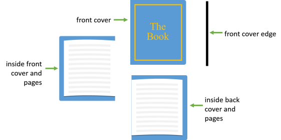
  • I used the Selection Pane to name the objects and set the front-to-back order (front on top):

book2

  • Here’s the Animation Pane (with some notes):

book3

  • The basic animation consists of the Collapse to Left of the front cover, followed by the Stretch of the back of the front cover and pages. The back cover and pages are not animated but appear as the front cover “opens.”
  • To enhance the effect, I added the “edge” of the front cover (black in the example) that gradually appears and then disappears as the cover moves. The effect is created by a Stretch (Across) and Collapse combined with simultaneous motion paths (a single path could have ben used).
  • The timing is relatively slow; this helps when verifying the animation.
  • You can guess how the “close” effect works given the “open” example. The close effect is faster – I would use this timing for the actual presentation.

*******************************

Powerpointy Tip:  The Selection Pane (one of my favorite tools) is useful in this example but it is crucial in more complex, layered constructions like the second example in this post.

The Selection Pane allows you to:

  • Assign meaningful names to objects – these names will also appear in the Animation Pane.
  • Easily select objects even if they are hidden under other objects
  • Collapse group entries so that their details are hidden in the list
  • Temporarily make objects invisible
  • See and manage the ordering (layering) of objects

There is no checking for duplicate names so be careful.

*******************************

This first try at a book animation is pretty flat looking.  It looks like a pamphlet since the thickness of the book is not apparent.

To create a more convincing effect, I developed this model:

book4This model presents three stages in the animation, vertically aligned and viewed from the bottom edge of the book. In the initial position, only the front cover of the book (blue)  is visible from above, but in later stages the spine (green), pages (red), and back cover are visible.

The crosshatched elements are “rulers” used the help size the elements of the animation. I have set vertical Drawing Guides (barely visible in this screen shot) at critical positions so that they can be used later to position and size elements of the animation and to determine the end points of motion paths.

The intermediate stage shows the front cover in a vertical position so that only its edge is visible from above. Only the edges of the front group of pages are visible. The spine is rotated half way and the back group of pages is visible. The back cover does not move.

I hope the movement of the stacks of pages is clear from the model. I kept the top page (top edge of the red parallelogram) anchored to the middle of the book and the bottom page at the original position. As you can see, the page edge exposure increases in width during the animation.

In the final position, the covers and spine lay flat. The pages still meet in the middle and the page edge exposure is larger.

*******************************

Powerpointy Tip: To help size and align objects, enable Snap to Grid and set the grid spacing to a useful number. In the model above,the smallest dimension is 0.1 inches so I set the grid to 0.05 inches. This provides “snap” action to help align the edges and centers of objects.

*******************************

In the spirit of “divide and conquer,” I will do the animation in “layers” and in stages. This simplifies the process and avoids some issues with locating motion paths that are close together.

The first step is to animate the first transition of the top layer (the front cover). The black arrow shows the intended motion on the slide layout:

book5

The front cover is aligned (using the Drawing Guide) with the appropriate part of the model. A Collapse exit effect With a motion path terminated on another Drawing Guide completes this part of the animation. Here’s the result:

*******************************

Special Announcement: All motion paths in this post have the Smooth Start/Stop timing set to zero. Some Microsoft genius set the default motion path with non-zero Smooth Start/Stop timings, so I have to reset them each time.

*******************************

By the way, when you combine the Stretch effect With the motion path, the Stretch must appear first in the animation pane list; otherwise the motion path will not occur. There may be other anomalies of this kind; I don’t have the energy now to ferret them out.

Here are the rest of the animation parts and some notes:

  • The first animation shows the first transition of the spine to a partly open position.
  • In the “Second transition – front cover and spine,” the back of the front cover and the remaining part of the spine are grouped together.
  • In the “First transition – right page and edges,” the right page moves left to reveal the page edges.
  • Next, the top stack of pages opens to the intermediate position and then to the final position, revealing the edges. The second transition animation includes a Grow so that the page edge exposure widens (the grow value is 166% computed from the two widths in the model).
  • The final animation shows the front cover edge as before.

I combined these objects and animation onto a slide, using the Drawing Guides, making sure that the front-to-back order is correct (reference the model and use the Selection pane) and that the order of animations is correct. This is the result:

Now I need to make this look more like a book and include the message. Unfortunately, I can’t ungroup or add details to the objects by grouping without losing the animations. So, I will create the details, convert to pictures and fill the objects with the pictures. (I think I could have used the Animation Paintbrush to reapply the animations after adding details by grouping but I didn’t.)

Here are the parts of the book and some notes:

book6

  • I used Pattern fill (the Confetti pattern) for the “leather” parts. Also, the page edges object uses the Light Vertical pattern.
  • I added internal shadows to the text and other parts of the cover to get an embossed look.
  • The pages have a temporary red outline for clarity. The small “text” lines are Rectangles with a Wave fill.
  • I added a gradient fill to the pages to create a shadow where the pages meet.

To complete the fills, select a fill object and Copy it to put it on the Clipboard. Then, select the corresponding animated object and use Fill/Picture or texture/From clipboard. You should check out my post on picture fill to learn more about this.

Here’s the result:

Here are the Selection Pane (showing the front-to-back order) and the annotated Animation Pane for this project:

book7

Well, dear reader, what have we learned today about attacking a complex animation?

  • Have a plan – build a model showing the locations, orientations, etc., of the objects at various stages of the animation. This can be simple or complicated but the object is to create reference points for the animation.
  • Be precise – Use Snap to Grid to make it easier to locate and size objects in the model. Set Drawing Guides for key alignments and locations (end points of motion paths, for example).
  • Divide and conquer – if necessary, temporarily animate objects and phases of the animation on separate slides. This helps avoid confusion.
  • Combine with care – Use the Selection Pane to name objects, temporarily hide objects and to manage the front-to-back order. Use the Drawing Guides based on the model to locate, size and align objects.
  • Separate “design” from the mechanics of the animation – assemble the animation with simple objects and use Picture Fill and/or the Animation Paintbrush to complete the details of the objects.
  • Finally, control you expectations; this ain’t Pixar.

If you want to see more details, use the link below and click on the PowerPoint icon to download a free “source” PowerPoint file containing these objects:

Powerpointy – Opening the Book

See this page for more on downloading files.

If you have questions, praise or complaints, please add a comment below. If you appreciate my efforts, liking or following this blog might be a good idea.

PowerPoint Secrets – Where’s the Center?

banner

Here’s a a 144 pt Calibri character:

c22

An outline has been added (blue). The alignment is Center; the text box attributes are:

c23

Since you have read my post on the size of Calibri, you will not expect the character itself to be 144 pts high. The actual character height (green box) is about 1.26 in. The text box (blue) is 2.42 in high; I don’t know why (maybe it has something to do with line spacing). I have added a red bar 144 pts (2 in) high. None of the other dimensions seems to have any obvious relationship to 144 pts.

The situation is similar with Arial:

c21

The “graphical center” of the character is as indicated by the “handles;” rotating the object manually bears this out.

Or is  it?

Here’s the object with a Spin animation:

I added the blue lines to the object to indicate its “graphical center” and the red lines to show the position in the background.

Note that the Spin animation rotates the object around a different “animation center.” Some other animations are also affected; here’s a Grow/Shrink animation:

The gray image indicates where the animation should end up, based on the graphical center. The animation thinks the center is somewhere else,

Text typed into a shape has (apparently) different dimensions; here’s a 2 in circle with a 144 pt character (Do not autofit is selected):

c25The alignment tools treat this shape as expected, given the bounding box and handles.

However, animation treats this kind of shape differently. Here’s what a Spin animation looks like.

The shape wobbles because it is Spinning around a point different than the graphical center. Here’s how a few other objects containing the text Spin:

There is another area where the presence of text has an unexpected effect: conversion to pictures (pngs). Here are examples:

c24The first object is a rectangle with some lines added; the png version appears identical. The second object is the same but with text typed into it.  The png version is substantially bigger and the center is offset. I don’t know why.

The moral to this overall story is that when you’re working with text, there can be some unexpected results. There may be other anomalies than those mentioned here.

Following are some workarounds for these examples:

  • You can deal with the picture conversion issue by cropping the result to any size and shape you need.
  • You can also cure the wobble by converting the object to a picture and then cropping to get the center of the picture congruent with the geometric center. The disadvantage is, of course, that the picture can’t be edited like the original object.
  • You can group the object with a containing circle to force the center of rotation to any desired position.  Here’s an example; the circle is green but would normally be made invisible (No line). The circle must be made fairly large to eliminate the wobble:
  • When a character is typed into a shape, these anomalies occur when the text is large relative to the shape (even though it appears to be contained within the shape). You can fix them by reducing the text size but I assume there’s a reason you wanted the text large in the first place. By the way, I had to reduce the text size to 60 pts in a 2 in circle to get the wobble to go away – a reduction to about 40%.

Well, dear reader, I tire of these irritants and end this treatise. Resume your duties.

PowerPoint Animated Infographics – Timelines

banner

Infographics are “graphic visual representations of information… intended to present information quickly and clearly. They can improve cognition by utilizing graphics to enhance the human visual system’s ability to see patterns and trends,” according to Wikipedia.

Infographics are often used in business to present information, trends or relationships that are favorable to the company’s pitch, generally educating customers or establishing context for a discussion.

Typically, infographics seem to be print-oriented; that is, they are designed as if they were to be presented statically on an oddly-shaped sheet of paper. Here are some examples:

samples

In a web or presentation context, reading this kind of infographic requires considerable zooming and panning.  I have always thought that an interactive or scripted video is a much better way to present infographics. And, of course, PowerPoint can be used to create animated infographics. (Followers of Professor Tufte, please excuse the blasphemy.)

Infographics is a broad subject; I don’t propose to cover the entire field or pontificate on information graphics design and technique. Rather, I want to show you how to create video/interactive versions of common infographic styles.

To start with, consider “timelines.” This kind of infographic is used, for example, to show milestones in a historical context or to show sequential steps in a procedure. A video form can be interactive, allowing the reader to browse the information as needed, or scripted, presenting the information in a particular order, perhaps with an audio narration.

For this post, I’ll create a scripted version, starting with an overview of the timeline followed by sequential exposure of the milestones. Also, I will use a simple graphical model to represent a five step timeline rather than a fully developed infographic (I’ll try that in a later post). Here’s what I’m shooting for:

Here are some notes:

  • The overall timeline is shown first, followed by individual milestones with details, in order.
  • The overview would label each milestone  – perhaps with a date and/or title (first long distance electrical telegraph line,  1843).
  • Each milestone view would add detail and additional graphics (e.g., Samuel Morse, Morse’s biography, portrait, map, etc.). These can be exposed (animated) as needed to help comprehension.

The opening zoom effect is created combining Grow and motion path effects as I described in my two posts on “prezi-style” PowerPoint: here and here. By the way, this is a good application for prezi, if you can tolerate its idiosyncrasies.

Here are the details of the opening effect:

  • The timeline model  is a simple combination of Ovals (milestones) and a Rectangle. I want the result of the zoom to have the first milestone enlarged and centered on the slide space, along with the “line” leading to the next milestone. I chose an enlargement of 300%. Since the text may not automatically resize the way you want it to, adjust the font size manually as needed. Here’s what the slide should look like after the zoom:

timelines1

  • I used a “transition slide” between the first slide and the first milestone slide to implement the effect. I started by duplicating the first slide, making sure Drawing Guides are set to define the center of the timeline overview object.
  • I will apply a Grow/Shrink effect With a motion path to the timeline to create the transition. I need a “target object” to help get the motion path right.
  • To make the “target,” duplicate the object on the result slide (the enlarged milestone). For clarity, remove the fills and set the outlines to red:

timelines2

  • Now, add “crosshairs”to the first and third (center) milestones. These are just lines drawn horizontally and vertically on each circle and letting the lines “stick” to the appropriate 4 points on the circle. This is what I mean:

timelines3

  • Now move this target object to the transition slide so that the number one milestone is centered on the slide over the timeline object. (use the Drawing Guides to accomplish this). The target may not snap to this position; use nudges (arrow keys) to carefully position the target object (hold down Alt with the arrow keys if needed).
  • Here’s what the transition slide should look like; the target represents the desired position and size of the “zoomed” milestone:

timelines4

  • Select the timeline overview object and apply a Right motion path, Carefully extend the motion path to the center of the target object (marked by the crosshairs on the third milestone). Add a Grow/Shrink 300% effect to the overview object With the motion path. Here’s a closeup of the slide showing the motion path:

timelines5

  • Set the Smooth Start/End to zero for the motion path. You can experiment with other values to change the zoom effect.
  • Set the first animation on the transition slide to Start After Previous. Set the slide transition to None and Advance Slide to After 0:0:0 (this assures that the transition to the milestone slide will occur immediately after the animations).  By the way, this replaces the poor image that results from the Grow animation.
  • The slide order should be overview, transition, first milestone detail. Test the result to assure that the transition is smooth. You may have to adjust the motion path or the milestone object position.
  • Add animations to the milestone detail slide as needed.

The transitions to the subsequent milestones are Dynamic Content/Pans; this kind of transition keeps the objects on the slide Layout unchanged while applying the the transition to the slide “content “.  A special slide Layout containing the title line must be created; I covered the details in a post on transitions.

Make sure that the slide transitions and animations are timed appropriately and use File/Export/Create a Video to, well, create the video version. I use Internet Quality.

A final note: I have created a “scripted” infographic using video. An interactive version that would allow the reader to browse the timeline would require an interactive medium (e.g., Flash). I will experiment with this in a later post.

If you want to see more details, use the link below and click on the PowerPoint icon to download a free “source” PowerPoint file containing these objects:

PowerPointy blog – animated timeline

See this page for more on downloading files.

If you have questions, praise or complaints, please add a comment below. If you appreciate my efforts, liking or following this blog might be a good idea.


Animation in PowerPoint: Flow

banner

Presentations often show processes, networks, organization charts and similar structures. These systems are sometimes explained by “flow:” data flow in computer networks, material flows in industrial processes, information or cash flows in business processes, etc.

Animation is very useful in these kinds of representations; you can actually show and explain the movement and effect of  data, messages, and other “flow” elements.

This what I call a rational use of animation – actually adding to the impact and effectiveness of a presentation as opposed to distracting or actually putting off your audience. If you want more on this subject see this rant.

One very simple technique for showing a flow is a Wipe animation applied to a Dashed line; here are some examples:

The blue lines have a Round Dot Dash type and a Round Cap type. The green lines also have the Round Dot (oddly) but a Flat Cap type. The animation for all the lines is Wipe From Left; the lower lines have Repeat set to 4.

Here’s how the Wipe effect might be used in a diagram:

Here the flow is from left to right and the starting times are staggered.

There are a few other effects that work with some object outlines. Here’s an example:

Here I used the outline of an Oval shape and applied an Entrance animation effect called Wheel; the Repeat option is used. This effect has a parameter called Spokes; setting Spokes to 4 yields this result:

There are limitations to using Wipe and similar effects. A more flexible approach is to use motion paths; this example shows a continuous flow of separate objects:

Some notes on this effect:

  • Each of the four objects (circles) has a Line motion path with Smooth Start/End set to zero.
  • The Duration of each motion path is 2 sec.; each motion path is delayed by 0.5 sec. relative the the previous one.
  • Each motion path has Repeat = 3. The timing is set so that the flow is uniform. Here is the animation pane:

flo1

An attempt at 2-way flow, this version applies Auto-reverse and Repeat =3 to the motion paths for seven objects with the same timing as above:

As you can see, this is pretty confusing. It’s probably better to use separate sets of motion paths to demonstrate 2-way flow as in these two examples:

The second example uses a curved motion path.

For some applications, it is useful to animate discrete messages and use callouts to identify the messages. Here’s a whimsical demo showing interactions in a network:

My post on demonstrating a computer network includes a more elaborate example.

You can also show continuous flows (like a fluid); here’s a simple example:

This applies the Wipe animation to five separate objects in order. Since the options for Wipe (and Stretch) are From Left/Right/Top/Bottom, this technique works best for horizontal or vertical straight flows. (My post on liquids shows similar effects.)

Here’s another example:

This uses some of the techniques in my post on pipes and wires. Here are some details:

  • Basically,  the pipes are created as shapes with 3d effects applied and converted to png images. To get transparent pipes, apply transparency to the shapes before converting to images.
  • Rounded rectangles are used as the fluid – this makes the flow through the bend a little more convincing (this ain’t perfect but it took several tries to get this effect).

Showing a continuous fluid flow over a curved path is a little more complicated. Here’s a way to do it:

The first animation is essentially the same as the earlier examples but with a shorter interval between motion paths (0.1 sec). The second animation adds curved Lines to complete (I hope) the illusion.

If you use a different shape (not a circle), you may have to rotate it as it follows the path. My roller coaster post addresses this.

If you want a free PowerPoint file containing these examples, use the link below and click on the PowerPoint icon to download a “source” PowerPoint file containing these objects:

Powerpointy blog – flow

See this page for more on downloading files.

If you have questions, praise or complaints, please add a comment below. If you appreciate my efforts, liking or following this blog might be a good idea. If there are other topics you would like to see in this blog, please leave a comment or click on “Contact the author” in the banner above to email me.

PowerPoint Secrets: More Transitions as Animations

banner

This is a follow-up to the last post which was about using slide transitions in the role of on-slide animations. One technique I demonstrated was to create a separate file using the transition effect, convert it to a video, and insert it into the presentation.

This post will not make much sense unless you read the last one.

At the end of the post, I suggested that this doesn’t work very well for some transitions. For example, if I try to create a photo carousel effect  using a Gallery transition, this is the result:

The black artifacts that appear are probably not desirable. About 11 of the available transitions in my version of PowerPoint have artifacts like this.

I also said that the size and shape of the slides in the presentation used to create the video can also have an effect. Here’s an example with a custom slide size:

Here’s how I did this one:

  • I created a new presentation and inserted the contract image into the first (blank) slide.
  • The image is about 7″x5.4″. I changed the slide size (Design/Slide Size/Custom…) to the same size plus an inch vertically. I’ll explain the extra inch later. Here’s what the slide looks like:

crush1

When you change the slide size, PowerPoint offers two options: Maximize and Ensure Fit. If you pick the first option, PowerPoint will basically leave your slide content alone. If you pick the second option, PowerPoint tries to scale objects on the slide to fit the new slide. This will often lead to distortions. I  usually pick the first option and layout the slide manually. Thanks but no thanks.

  • Next, I created the second blank slide and added a Crush transition.
  • After a few adjustments , I converted the presentation to video and inserted the video in my original presentation. (See the original post for details). Here’s what the resulting slide looks like:

crush2

  • I did not crop or resize the video frame. I did set it against the bottom margin of the slide so that the crushed contract appears to fall off the bottom of the slide (this is what the extra inch in the slide slide size is for).

Here’s another example announcing a new service:

This example uses the Curtain transition and shows how you can combine the re-sized video with an object (a simple proscenium) on the slide. In some ways, a video is just another PowerPoint object.

Here are some other useful things you can do with videos:

  • Crop and resize the video frame
  • Change the shape of the video frame
  • Synchronize the video with other animations
  • Edit (in a limited way) the video

Of course, you can do these things with any video, not just the ones you create. And there are other possibilities that I will explore in later posts.

Here’s an example

This example combines a video created with a Fracture transition with a simple Fly-in animation. Here are some details (again, refer to the previous post if you haven’t already):

  • The PowerPoint file from which the video was made has a square (7.5in x 7.5in) format.
    • The first slide contains the target image and the second contains the text.
    • The first  slide has no transition; the second has a Fracture transition with a 0.5 sec duration.
    • The first slide is set to advance after 0:00 sec; the second  advances on click.
    • The file was exported as a video.
  • I inserted the video into my presentation file, resized it to fit and changed the shape of the video to a circle.
  • The black circle has a Fly In/From Lower Left animation with the Hide After Animation option.
  • To get the timing right, I used video Trim to make sure that the video started at the time the Fracture effect started (there is a slight delay in the video – I’m not sure why).
  • I also used Trim to eliminate the last 5 seconds of the video; here’s what the Trim pane looks like:

trim

The extra 5 seconds in the original video is the default slide timing for the video conversion. This showed up because the last slide had Advance on Click set rather than a time – it was easier to fix this here than go back and re-make the video.

  • I also overlapped the animation with the video to get the timing to look right; here’s the animation pane:

anim

Here’s a similar experiment using the Ripple transition:

The details are similar to the Fracture example except that the Ripple effect has an unwanted “artifact” around the edges. I eliminated that by cropping the video a little more.

If you want to try some of these effects,  use the link below and click on the PowerPoint icon to download a free “source” PowerPoint file containing these examples:

Powerpointy blog – more transitions as animations

Here are the four video source (PowerPoint) files:

Powerpointy blog – crush video source file

Powerpointy blog – curtain video source file

Powerpointy blog – target video source file

Powerpointy blog – ripple video source file

See this page for more on downloading files.

If you have questions, praise or complaints, please add a comment below. If you appreciate my efforts, liking or following this blog might be a good idea.

PowerPoint Secrets – Using Transitions as Animations

escher

In my last post, I used a slide transition to simplify construction of a “photo carousel” effect. This post is about using transitions in other unusual ways.

But first, I beg your indulgence for a short rant about transitions. To wit: transitions are like animation in general; using transitions just because Microsoft says they are “exciting” is poisonous. They should be used only for a reason (see this post for a more complete essay on this subject). See this article for a similar view. Finally, see this source to see how bad this kind of thing can get.

The carousel post used a “dynamic content” transition; this essentially allows you to specify which objects on the slide are affected by the transition effect. Other objects (e.g., the slide title, background and your logo) remain fixed during the transition. So, the effect looks like an animation rather than a transition.

In the usual transitions, the entire slide is affected. Of course, in some cases, this not apparent. Here’s an example using a transition to a second slide to mimic an Entrance animation:

This is a Random Bars transition but, since the two slides are identical except for the “review” box, only the review box “appears.” Unfortunately, this doesn’t add much to our toolbox, since only 8 of the 45 available transitions (in my version of PowerPoint) work this way. And these don’t add much to our animation repertoire.

In some cases, a transition that affects the entire slide can be used effectively. Here’s an example:

This is a version of an effect I developed in my earlier breakthrough post. This one uses a Fracture transition and is much simpler to create.

Only a few dynamic content transitions (7 in my version) are available. Is there a way to use the other transitions as animations? The answer is, as you might expect, sort of.

The trick is to build the transition effect in a separate file, convert it to video, and then insert into your presentation where needed.

Whoa, you might say. Isn’t this overkill? Is it worth it to get involved in the complications of video?

Don’t be intimidated, dear reader. PowerPoint video conversions are easy and work quite well. How do you think I made all the demos you see in these posts? In fact I think I’ll look at some more video-related projects in upcoming posts.

Here is a project that uses a video for the “curtain” effect:

Here’s how:

  • The basic slide is created first, with the text.
  • In a separate presentation, create two slides. The first is the customer service agent, and the second is a rectangle with the text “PLEASE WAIT.” The rectangle is sized and positioned so that, after the transition to the second slide, the rectangle will cover the agent. The slides look like this:

cs1

  • On slide one, set the transition to None, and check the Advance Slide/After 00:00:00 box. This will make the transition to the nest slide occur automatically, immediately after the presentation starts. On slide 2, set the transition to Drape and set the Duration (2.75 sec in my case). Also, check the Advance Slide/On Click box; this prevents the presentation from ending with a black screen.
  • Run Slide Show to check the results. Edit the slides as needed.
  • Now convert to video: select File/Export/Create a Video.
  • Select Internet Quality; this is usually sufficient for presentations.
  • The Use Recorded Timings and Narrations box should appear; this means that the conversion will  use the transition timings you have set. If this box doesn’t appear automatically, go back and make sure that the slide transitions are timed rather than “on click.”
  • Click Create Video. I usually use the filename of the PowerPoint file (the default) for the video. Conversion may take a while; there is an indicator that the conversion is happening at the bottom of the PowerPoint window.
  • Here’s what the video looks like:
  • Next, insert the video in the original slide. Select Insert/Video/Video on My PC… and select the video created above. I used the same slide size for the video as the original so the inserted video placeholder will cover the whole slide.
  • In Video Tools/Playback, set Start to Automatically. This will put the video in the Animation Pane like an animation effect.
  • Click on the video placeholder and use Video Tools/Format/Crop and resize to get the video placeholder to the right shape, size and location. This is just like working with a Picture.
  • Open the Animation Pane. You will see the video as an event and as a “trigger” item. The trigger is not needed in this application; Remove it from the animation pane.
  • Animate the text and set the timing relative to the video as needed. Note that the duration of the video does not appear, unfortunately.  Here’s the slide and animation pane:

cs2

  • Run Slideshow to verify the effect: the second line of text and the “curtain” should appear on click.

Here are some additional notes on this technique:

  • In the example, the backgrounds of the presentation and the video are the same (white); that is, the background of the PowerPoint file used to create the video is the same as the background where the video will be used. You can get away with this for a uniformly colored background but a more complicated (e.g., gradient) background may cause problems.
  • Some transitions involve extra “background” elements. For example, Gallery moves the slide images against a black background that you may not want and there is no way to make this disappear.
  • Using a bigger crop of the video may increase (or not) the impact of the effect. You can set the aspect ratio (slide size) of the PowerPoint file used to create the video so that you can use the entire slide if you desire.

Wow. This is getting more complicated than I intended. So, I’ll show some more examples in a follow-up post. You can try experimenting with the technique in the meantime.

As usual, if you want a free copy of the PowerPoint files used in this post, use the link below and click on the PowerPoint icon to download a “source” PowerPoint file:

Powerpointy blog – transitions as animations

Here is the source file for the video:

Powerpointy blog – sm cutain video source file

See this page for more on downloading files.

If you have questions, praise or complaints, please add a comment below. If you appreciate my efforts, liking or following this blog might be a good idea.

PowerPoint Animation – Unstacking/Stacking Effects (Update)

banner

In a previous post, I described a project where a client wanted to recreate an effect on his website in PowerPoint: a “carousel” display of photos representing the company’s global locations. My approach turned out to be fairly complicated; this post uses a much simpler technique to produce a similar result.

NOTE: Since this post was written, the Morph slide transition has been added to PowerPoint. It provides yet another, relatively simple way to create these kinds of effects; see this post for details.

Here’s my new sequence:

This project uses a series of slides with slide transitions to create the effect rather than animations. In particular, “dynamic content” transitions are used. This feature was introduced in PowerPoint 2010; here’s how it works:

Slides contain two different kinds of objects (content). Some of the objects originate in the slide Layout (typically, backgrounds, bullet list placeholders, logo, slide number, etc.) and appear when a New Slide is created. These objects cannot be edited directly on the slide. Other objects (content) are created on the slide itself. In this project, the Title, Acme logo and the gold bar under the title are “layout content.” The “slide content” is the photograph and label. When a Dynamic Content transition is used, the layout objects do not move during the effect, as in the example above. So, the effect appears to apply to the photos and the slide remains fixed:

trans2

By the way, slide transitions are a lot like animations: there are a lot of loony effects available and haphazard use will distract and possibly nauseate your audience – not a good thing. Use transitions only when they add to your message (or when the client tells you to). For more on this view, see this rant.

Here are some notes on the “carousel” effect:

  • To keep the title text from moving, I created a new Layout with the desired title as a text box rather than the title placeholder. Go to View/Slide Master, select the slide layout you are using (Title Only Layout in my case), right click on it and select Duplicate layout. A new layout name will be supplied but you can edit the name as needed. On the new layout, delete the title placeholder and create a text box in its place; the text is now part of the layout and will stay put. Use this layout for your carousel slides.
  • For the smoothest result, all the photos should be the same size. An easy way to do this is to create a Rectangle of the appropriate size, and use it as a “cookie cutter” to get properly sized photos.
    • Place the Rectangle over the photo and position and/or resize the photo until the part of the photo inside the Rectangle is what you want; here’s an example with the Rectangle outlined in yellow for contrast:

trans1

    • Now, select the Rectangle and then the photo and apply Merge Shapes/Intersect.

A reader has informed me that Merge Shapes doesn’t work on pictures in PowerPoint 2010 and earlier. You can use Crop and resize to fix the pictures.

  • Position the photos in the same place on each slide in the series (use Drawing Guides to help).
  • A Rectangle with a semi-transparent fill is used as the photo label. This is a good way to assure legible text over a “noisy” background.
  • For each slide, except the first, apply the Dynamic Content transition Rotate (in the Transitions tab).
  • Since you probably don’t want to click through each slide, set Advance Slide/After… with an appropriate timing. You can also adjust the transition Duration to your liking. Here are the settings for this project:

trans3

Although this effect is not exactly the same as the one I did using animations, it is a bunch easier.

This project makes me wonder if I can use some of the other transition effects in a similar way. I’ll look at that in the next post.

If you want a free PowerPoint copy of this project, use the link below and click on the PowerPoint icon to download a “source” PowerPoint file:

Powerpointy blog – carousel

See this page for more on downloading files.

If you have questions, praise or complaints, please add a comment below. If you appreciate my efforts, liking or following this blog might be a good idea.

Let There Be Light (in PowerPoint)

 banner

Flashlights, searchlights and lamps can suggest searching, discovery, revelation and even celebration in presentations. This post is about creating these dramatic effects in PowerPoint.

Creating light beams and lighted areas involves gradient fills and transparency. The PowerPoint gradient fill tools are clumsy but I can get acceptable results with very simple gradients, using Soft Edges as a shortcut.

I don’t have a lot of experience with graphics software, but I have seen tools for creating gradients that are a lot more intuitive than PowerPoint’s. I usually struggle with how the sliders relate to the actual object and what the options (Type and Direction) are actually going to do. It doesn’t help that the Pre-sets are pretty complicated and difficult to use as starting points. Ah, well.

Look at photos of flashlights, searchlights, etc., in action to get an idea of what beams and other light effects look like. As a matter of style and practicality, you will probably want to simplify these in your presentation.

The most dramatic effects are with very light (!) colored shapes against a fairly dark background. Here’s an example “beam:”

lite1

This Trapezoid has a gradient fill with white ranging from 0 (at the small end) to 55% transparency. Soft Edge is also applied. Here are the Fill settings for the Trapezoid:

lite2

I’ve used only two transition points for this effect;sometimes I use three. Any more than that is confusing. And, make sure that Rotate with Shape is checked.

This shape is used in my first project:

Here are some details:

  • The flashlight is a circle with some 3d effects applied: a top and bottom Bevel, Depth and Rotation. Here’s an overview showing the effect of the Bevels:

lite4

  • Here are a couple of rotations of the flashlight:

lite5

This is an example of the kind of object that can be created with “3d bevels.” Other kinds of objects can be created with additional techniques; see this post on toy blocks. However, PowerPoint 3d is limited; some of your ideas for 3d objects may be impossible.

  • The lit area is simply a gray oval (no transparency) with soft edges.
  • The oval, beam and text are grouped so that a single animation works.
  • A semi-transparent rectangle is placed over the flashlight; it disappears in the animation. Here’s the slide:

lite6

  • Here’s the animation pane. A fast (0.1 sec) Fade (exit) is used for the masking rectangle and a 0.1 sec Wipe for the beam group. The wipe is not strictly accurate (light is much faster that this) but it has a nice effect.

lite7

Here’s the next project:

Here are some details:

  • The lamp is made from standard shapes; the shade is a Chord and the wire is a Curve:

lite8

  • The bills in the pile of cash are Block Arcs with a green fill and border, flattened:

lite9

  • The coins are a couple of Rounded Rectangles with a shadow Line:

lite10

  • The beam is the Trapezoid used in the last example but it has been converted to a picture (Copy/Paste Special) and Cropped to give it a sharp lower edge.
  • The “glow” is a circle with a gradient fill, converted to a picture and cropped. This represents reflected/scattered light from the lamp and adds to the overall effect.
  • The animation for the light effect is a quick (0.1 sec) Wipe for the beam with a simultaneous entrance Fade for the cash and the ambient glow.

Here’s another project – a flashy (!) introduction:

Here are the details:

  • The slide has 5 “layers:”
    • The slide background is formatted with one of the presets. I used blue rather than dark gray for this slide.
    • Two searchlight beams are in front of the background.
    • The skyline is next – a series of black rectangles.  (You might want to add lighted windows to the buildings.)
    • The marquee is in front of the skyline.
    • Two searchlights are in front of the marquee.
  • The searchlight beams are gradient-filled Rectangles with Soft Edges like the flashlight beam in the first project. (Search lights are more tightly focused than the typical flashlight so I used a rectangle rather than the trapezoid.) I added a Rectangle to the beams in front to represent the searchlight.
  • I often group an invisible circle with objects so that the center of rotation is where I want it to be. I added a circle to the beams so that they “sweep” properly:

lite11

  • The beam animation for the searchlights is a Spin of around 60 degrees with Auto-reverse and Repeat/Until end of slide selected. The duration is around 6 seconds. The timing and Spin amount vary slightly.
  • The marquee is composed of a couple of Rectangles and some stars and circles:

lite12

  • A blinking light on the marquee involves two circles, one white-filled in front of one blue-filled. The white circle appears and disappears over the blue one to give the effect of blinking. Here are two sets of three circles:

lite13

  • The animation for the white circles is a quick (0.5 sec) entrance Fade. The timing parameters are set to “rewind” the fade and repeat. The start time for each circle is offset by 0.2 sec. Here’re the animation setup and the fade parameters:

lite14

  • I copied the 2 sets of three circles and placed them around the edge of the marquee to finish the effect.

If turning on a light means something, maybe turning one off means something, too. Here’s the last project:

I used the same techniques for this effect, observing that a shaded lamp casts light upwards and downwards along with creating an ambient glow.

If you want to try some of these effects, use the link below and click on the PowerPoint icon to download a “source” PowerPoint file containing these slides:

Powerpointy blog – lights

See this page for more on downloading files.

If you have questions, praise or complaints, please add a comment below. If you appreciate my efforts, liking or following this blog might be a good idea.


PowerPoint Secrets: Pictures in Shapes

banner

Several of these posts have used Shapes filled with pictures; for example, the popular jigsaw puzzle series and this one. I have also filled text with pictures (see this post). Since this process is not simple in PowerPoint, I decided to document the options and recommend the easiest method.

There are at least five separate ways to fill a shape with a picture:

  1. Format Shape/Shape options/Fill/Picture or texture fill – this “fill” option seems the most obvious approach.
  2. Merge Shapes/Intersection – this is not so obvious but it works well.
  3. Slide Background Fill – this option Fills the shape with the part of the slide background behind it – another blog suggests this method.
  4. Crop to Shape – an option that allows you to select a shape (other than a rectangle) for the result of a Crop operation.
  5. Placeholder – this is a special shape in SmartArt layouts or in a slide layout that is “pre-programmed” so that it can be filled with a picture with a single click (or at least that seems to be the intent).

I’ll demonstrate the methods with this example:

picf1

Starting with the image of the woman with a laptop and shopping bags, I want to capture the woman’s face and the hand holding the credit card. And, I want the result to be a circle.

Fill/Picture

These are the steps using the Fill/Picture option:

  • Create the circle and Copy the original image to place it on the clipboard. Under Fill, select the Picture or texture option, and Insert picture from/Clipboard. (I use the Format Picture pane to access this function; of course, there are other ways. Also, you may want to Insert from/File.) Here’s the result:

picf2

  • Oops. The fill function has re-sized and distorted the entire original image to fit it into the circle. Not what I had in mind. The solution is to select the Tile picture as texture option.

WTF, you may well say. Tile? Texture? What this astoundingly obscure option means is that, rather than resize and ignore the proportions of the original image, the fill process will use the unscaled, undistorted original image to fill the shape, repeating it in a grid (tiling) as necessary to fill the shape. For some reason, this is not the default.

  • Here’s the result of using the Tile… option:

picf3

  • Oops again. But, have patience; there is a way out. The Fill has retained the size and proportions of the original picture but its position relative to the circle is not what I want. Trying the Alignment/Center option (Top Left is the default!) yields this:

picf4

  • Now I can use the Alignment and Scale options to get the result I want. About a hundred clicks later, here it is:

picf5

This is all very clumsy. A workaround that I have used in some of my previous posts is to Crop and scale the original picture before using the Fill. I resize and crop (click and drag operations) the image to “fit” the circle. Here’s what I mean (a blue outline has been added to the cropped image):

picf6

Now, using the pre-cropped picture as the source (via the clipboard), I can create the desired result immediately using Fill/Picture without the Tile... option and associated fiddling.

Either way, the result retains the characteristics of the shape including adjustment handles, if any, as well as a picture; that is, both Picture and Drawing tools can be used. In particular, the Edit Shape options are available.

The same method, including the pre-cropping workaround, applies to text filling – just make sure you are using text formatting tools rather than shape formatting (see this post for details). The result of a text picture fill is a text box with picture characteristics (i.e., drawing, text and picture tools all apply).

Intersection

Beginning with PowerPoint 2010, Merge Shape tools are provided. The Intersection option provides a simple, intuitive method for picture filling a shape (or text). Here’s the method:

  • Create the shape (no fill) and resize and position it over the picture so that the desired part of the picture in in the shape outline:

picf7

  • Now, select the picture, then the shape, and use Merge Picture/Intersection. You’re done!

I call this the cookie cutter method. Note that the result is a picture, not a shape. Also, the order of selection (picture first) is important.

A reader has informed me that that the Merge tools do not work on pictures in PowerPoint 2010. Sorry; 2010 users should probably use the pre-cropping method described above.

The cookie cutter method also works with text:

picf8

Again, the result is a picture; in particular, the text can’t be edited.

Slide Background Fill

This method is suggested by a fellow blogger and her colleagues; check out her YouTube Channel and tutorials.

I think this option was originally intended to provide a way to create an object that hides or masks objects behind it – this technique is sometimes used to create effects.

The basic method is to set the source image as the background for the slide, position the shape over the desired part of the image and use Slide Background Fill on the shape. Then, position a filled rectangle behind the shape to hide the rest of the slide background.

However, the shape fill will change as the shape is moved, reflecting whatever is currently behind it. So, you will need to position the image and shape carefully to start; this can be a little tricky.

Here’s an example:

pictf14.png

If you move the circle now (or copy it to another slide), it will show a different image:

This method will not work with text; the Slide background fill is not available.

During animation (motion or grow/shrink, for example) the image in the circle will not change.

Crop to Shape

Crop to Shape also provides a way to create, for example, a circle-shaped picture. Here’s the process:

  • Under Crop, select the desired Aspect Ratio; for my example, it’s 1:1:

picf9

  • In the Crop pulldown, select the desired Shape (Oval). Essentially all pre-defined shapes are available (except Freeform and Lines). Move the the cropping mask to reveal the desired part of the image:

picf10

  • Resize the cropping shape to get the desired result (use Cntl/Shift or reset the Aspect Ratio to retain the circle shape):

picf11The result of these operations is a picture.

Placeholders

Placeholders show up in some slide layouts or in SmartArt layouts. If you click on a Picture placeholder, you will be invited to select a picture to be placed in the placeholder. Since placeholders have a shape, the resulting picture will have that shape.

Here’s how this works with a Smart Art layout:

  • Select a layout; this is Circular Picture Callout in the Picture group:

picf12

  • Each of the circles with the picture icon is a picture placeholder. Click on the placeholder and you will be presented with options for locating the picture (it must be a file on your computer or elsewhere). I located the picture and get this result:

picf13

  • Now,use the Picture Fill tools as described above to get the desired result. Pre-cropping the picture will make this easier but remember that you must save the pre-cropped picture as a file since filling from the Clipboard is not an option with this method.

In the unlikely case that you are using a Picture Placeholder in a slide layout, the process is the same as for SmartArt except the file must be located on your computer; the other global search options are not provided.

Summary

Here’s my summary (the easier method gets a higher score). Of course, the rating is subjective; you may disagree:

tab.png

If this post has been useful to you, please comment and follow this blog. If there are other topics you would like to see in this blog, please leave a comment or click on “Contact the author” in the banner above to email me.


Follow powerpointy on WordPress.com